Here is a selection of my most successful logos
Nails by Suzanne
Brief: Design a striking logo for an independent, fashionable Nail Technician.
Concept: Dripping in Gold - The colour Gold has a luxurious and Royal feel to it, with the visual element of dripping nail varnish reinforcing this idea both literally and hypothetically.

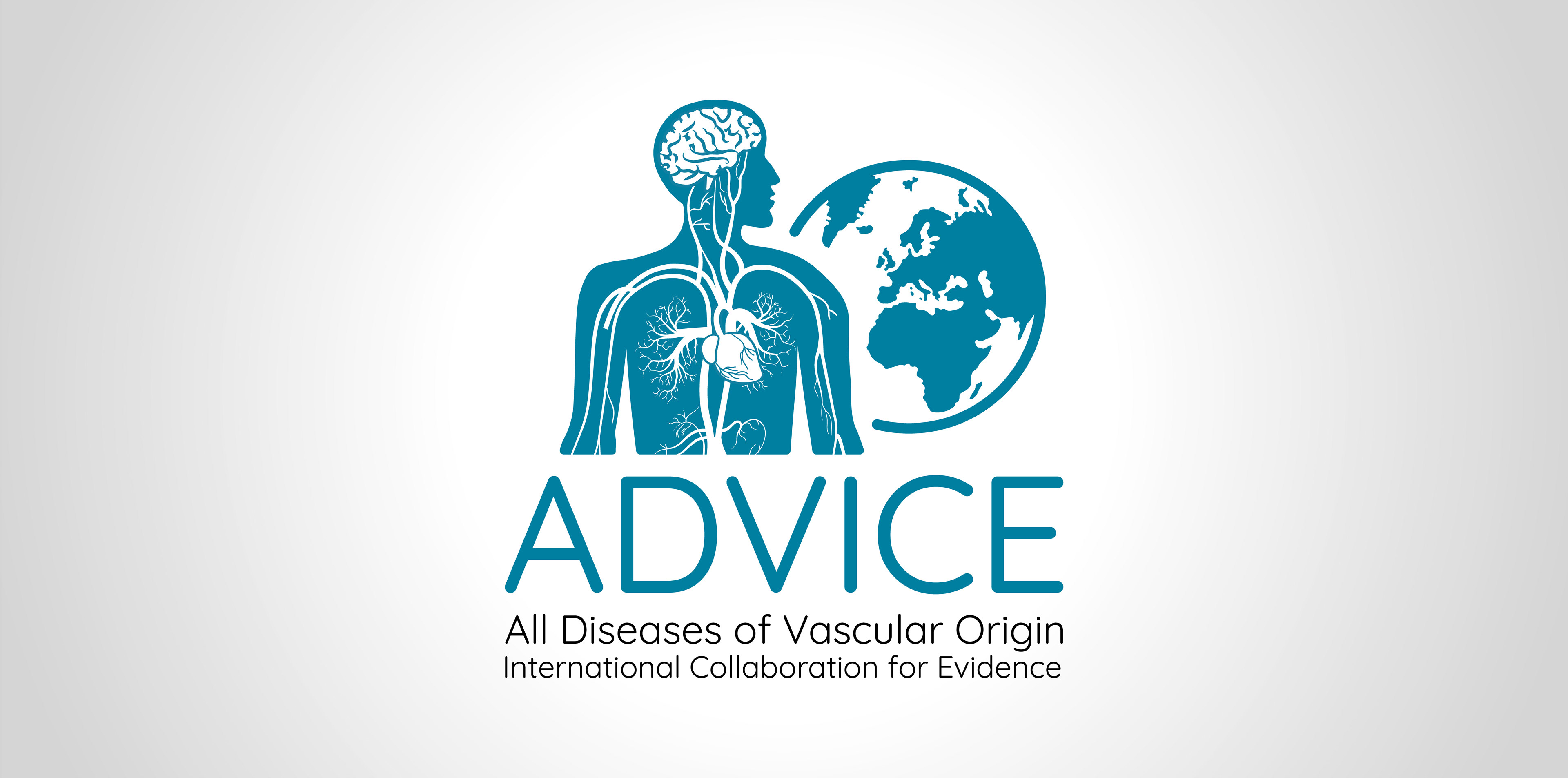
ADVICE
Brief: Design a logo that shows the circulatory system of the human body, including the brain and heart.
Idea: I cropped the human body, to show a close up area of the brain, heart and blood vessels to really focus on the body's circulatory system. I feel cutting off the legs and arms gave room to show this area in much more detail and allowed me to create a better composition with the world to reinforce the 'International' aspect.
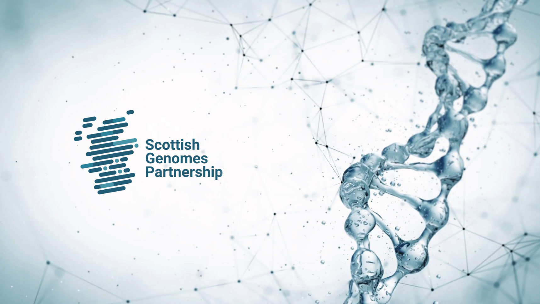
Scottish Genomes Partnership
Brief: Create a logo for the Scottish Genomes Partnership that incorporates genomics and identifies the 4 Scottish city partnerships, Aberdeen, Glasgow, Dundee & Edinburgh.
Concept: Data sharing - The logo is made up of scientific data symbols in the shape of Scotland, with the 4 partnership cities marked on the map.
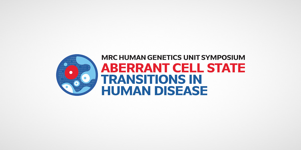
Aberrant Cell State Transition in Human Disease
Brief: Come up with an identity that gets across the idea of a healthy cell turned rogue.
Idea: I portrayed the rogue cell much larger and made it stand out using colour. These cells are presented in a petri dish as though they are being examined, tested and compared.
Gif below used for social media purposes

Scientific Workshop logo
Brief: Create a logo that captured the essence of the workshop team.
Idea: Illustrate the team, bringing together their fun and quirky sense of humour along with examples of the sort of work they do being incorporated into the lettering.
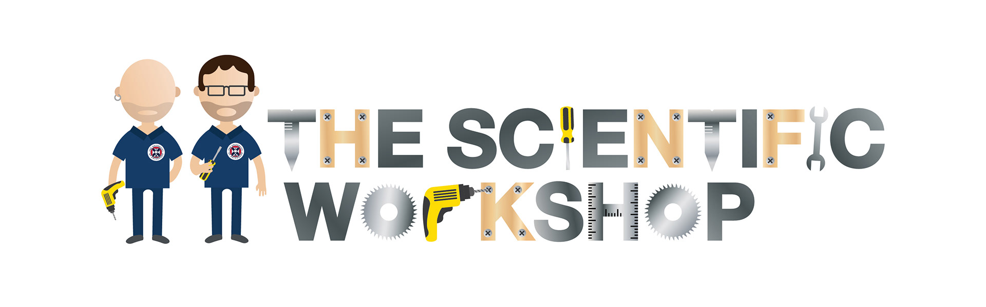
Gif below embedded into their email footer

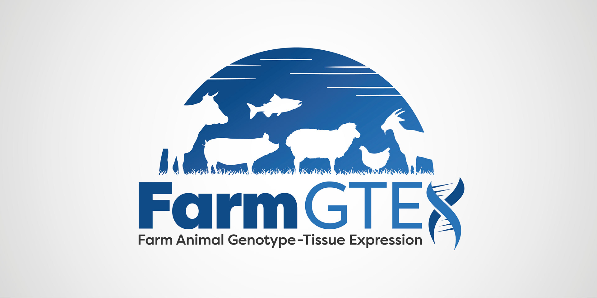
FarmGTEx
FarmGTEx work with the genetic makeup of farm animals. I have shown this through using a symbol of a helix as the 'x' in the logo. I have also shown the full list of farm animals included in the project to show the breadth they specialise in.
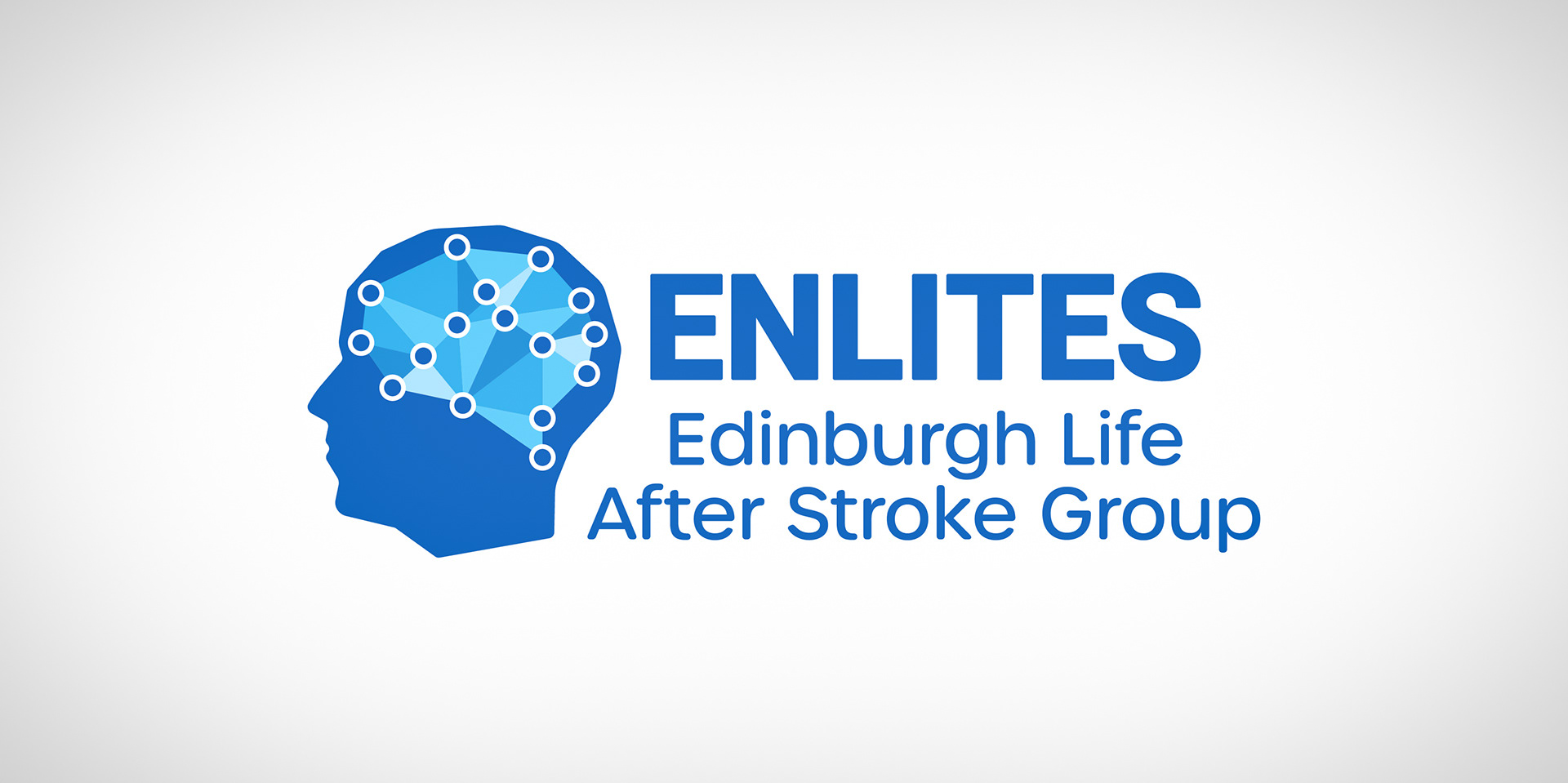
ENLITES Edinburgh Life After Stroke Group
I wanted to portray the complexity of the human mind. The connected dots representing all the people, scientists, carers and families working together as part of a community.
Self Branding
I used shapes to make up the lettering of my name. The concept for my identity was 'shaping the world around me'.
Through my creative thinking, ideas and passion, I help shape the world around me.

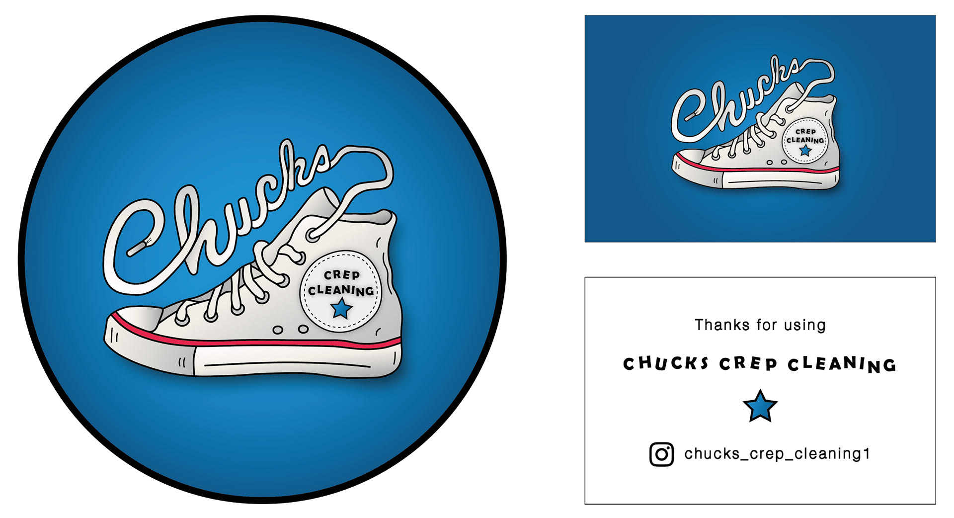
Chucks Crep Cleaning
Chucks Crep Cleaning is a trainer cleaning service. I chose a bright, bold and colourful comic book style. This created a fun and approachable feel for the brand.
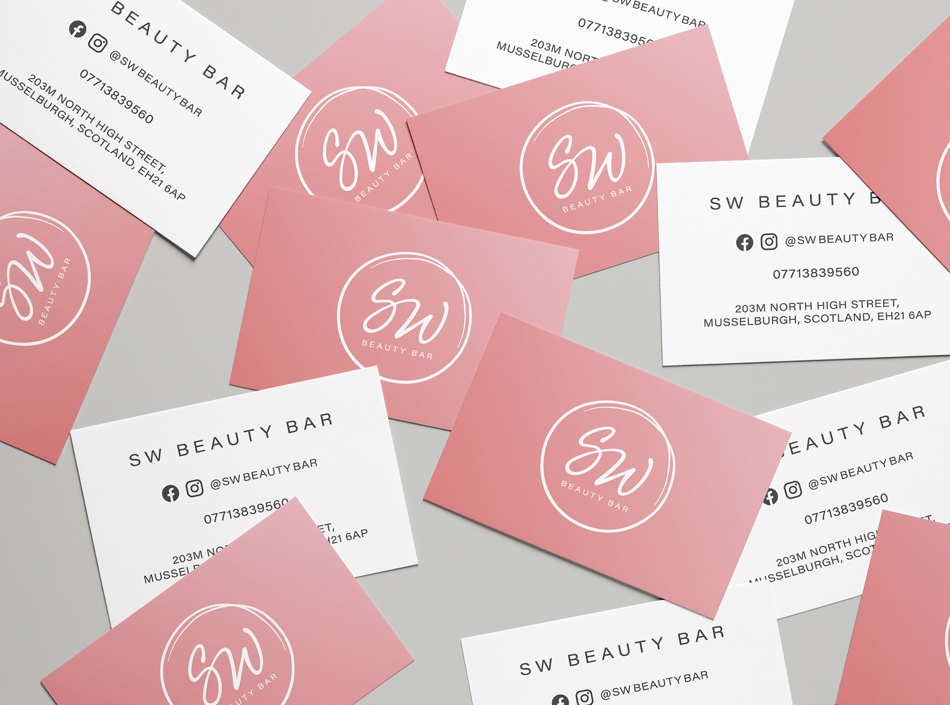
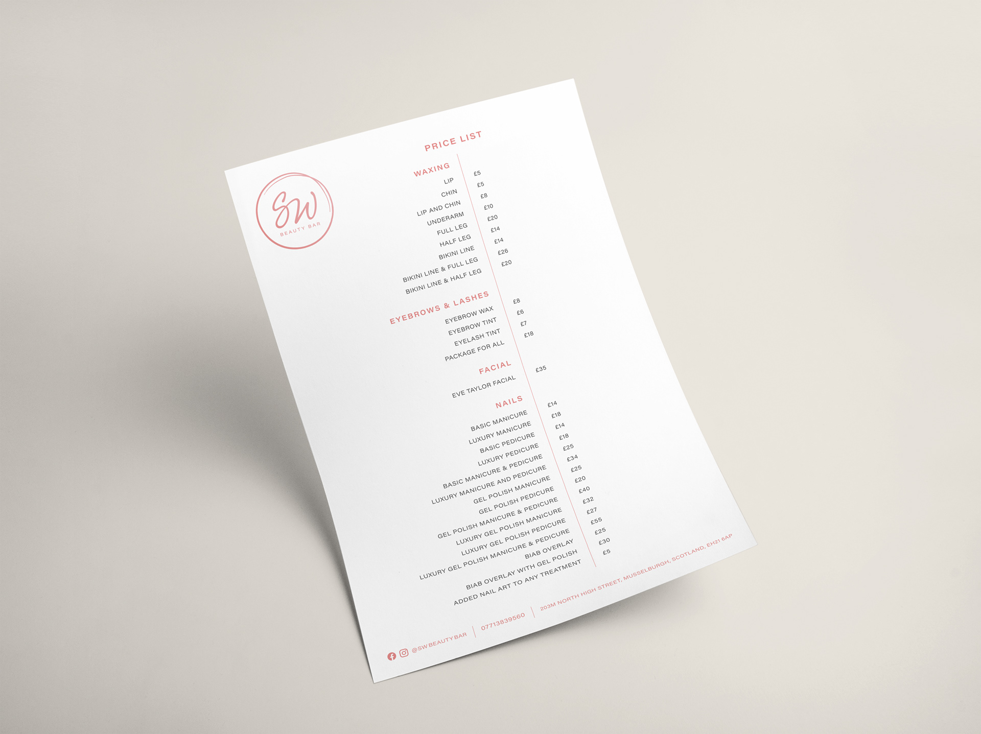
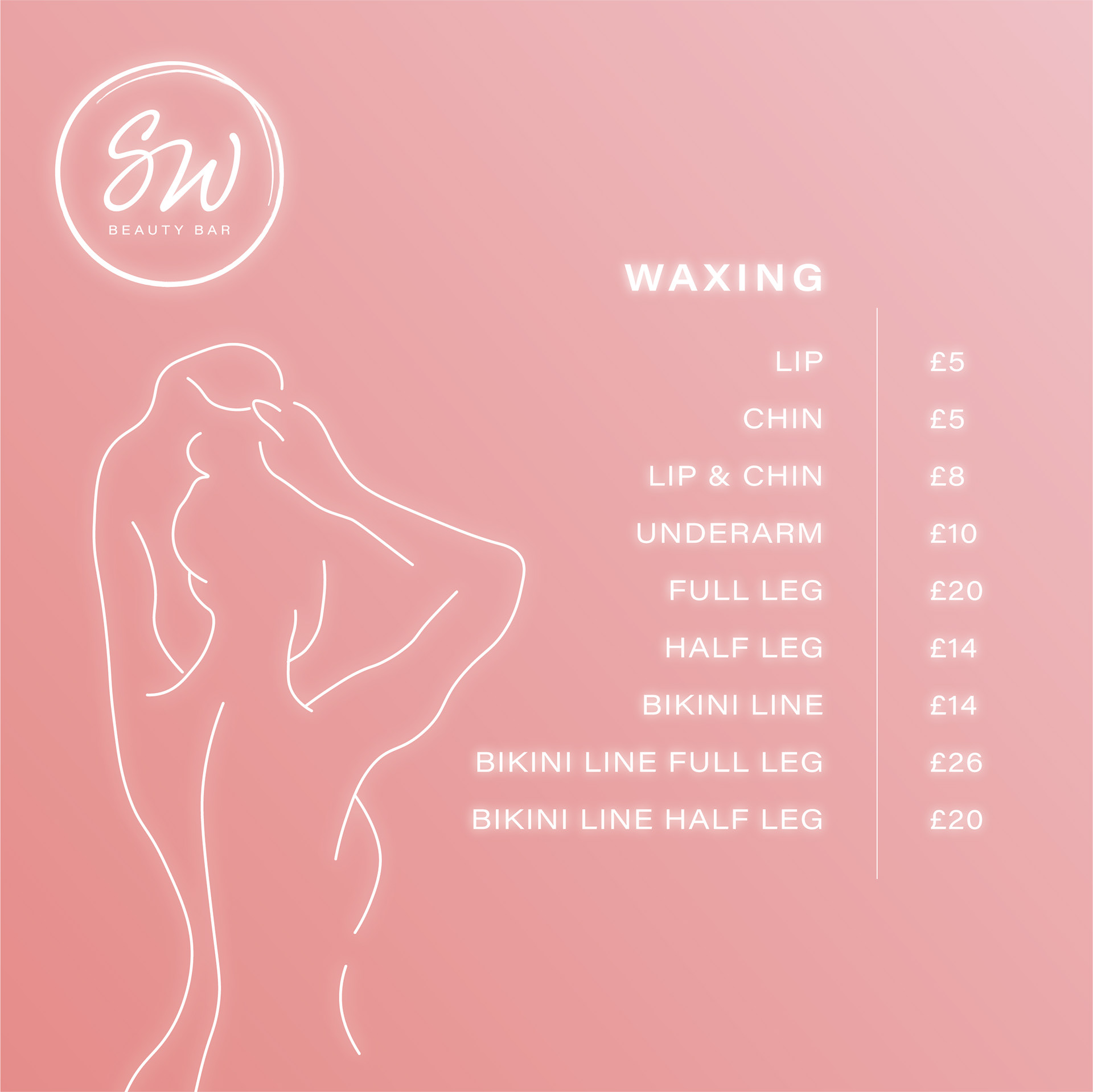
SW Beauty Bar
I was tasked to create a logo, business card and price list for a beauty bar. I had an open brief, but had to make sure the brand was simple and personalised. For this reason I went for a cursive type relating to a signature. I also used hand drawn illustrations to further push this idea.
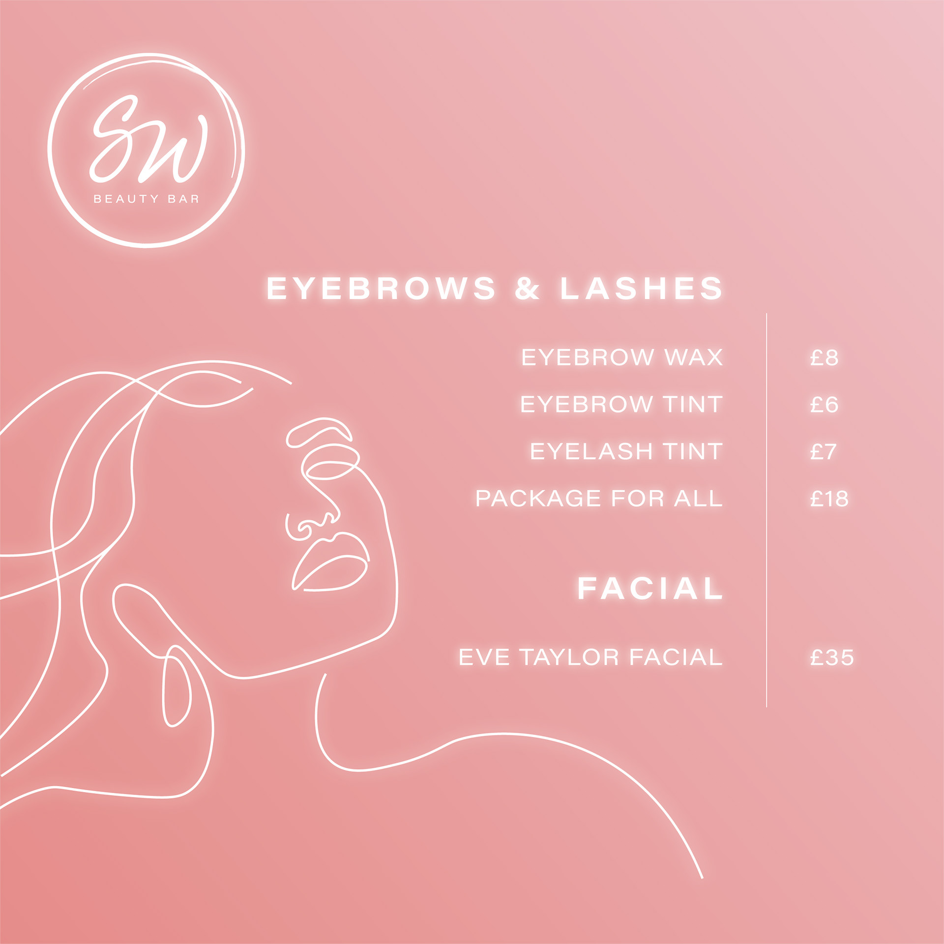
Instagram menu
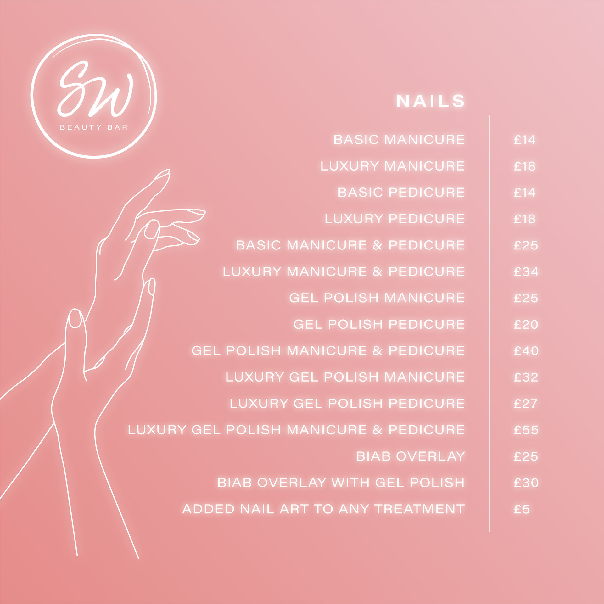
Instagram menu
Instagram menu
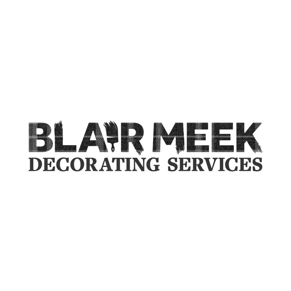
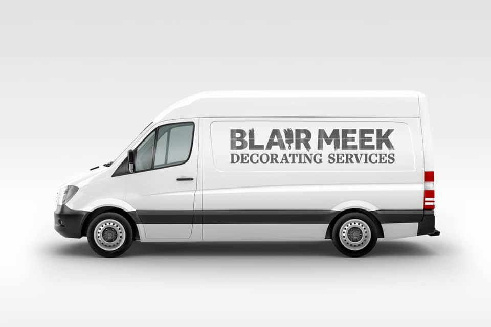
Blair Meek Decorating Services
I was tasked with creating a logo for a decorating service, specialising in painting. The business owner loves grey tartan, so this was one of the only key points in the design brief.